


Deepen your technical knowledge
Learn and share the latest technology with community members in Webscale’s Engineering Education Program.

How to Create a Reusable React Form component
Prerequisites In this tutorial, one ought to have the following: Basic React and Javascript knowledge. Understanding of npm and how to install from npm Atom or Visual studio code and npm installed...

Working with Bash Arrays
As a programmer, you may have come across or used the command line when building a tool, or for scripting. Bash is one of the most common command-line interpreters used for writing scripts. You can create variables, run for loops, work with arrays, etc with bashing...

How to Control Web Pages Visible to Different Users using PHP
Different categories of users access a website at any given time. However, some pages in a website are meant to be accessed by specific users. For instance, web pages accessed by the system administrator may not be the same as the pages which are accessible to the...
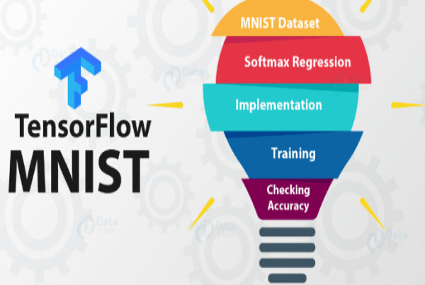
A Beginners Guide to SoftMax Regression Using TensorFlow
This article introduces basic softmax regression and its implementation in Python using TensorFlow to the learner. While implementing softmax regression in Python using TensorFlow, we will use the MNIST handwritten digit dataset. MNIST forms the basics of machine...

Implementing Secure Authentication with Keycloak
Many web-based applications implement authentication mechanisms to ensure security. However, securing these vulnerabilities from the ground up is a...

How to Make Multipart Requests in Android with Retrofit
A multipart request is an HTTP request that HTTP clients create to send files and data to an HTTP server. A multipart message is made up of several parts. One...

Page Transistions in React.js using Framer Motion
React.js framework allows us to create single-page applications (commonly referred to as SPA). A SPA is an application in which the pages do not reload for...
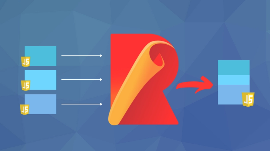
A Beginners Guide to Rollup Module Bundler
Being quick and lightweight, Rollup is credited with compressing multiple JavaScript files to a single file. In this article, you will learn how to use the...

Multivariate Time Series using Auto ARIMA
A time series is a collection of continuous data points recorded over time. It has equal intervals such as hourly, daily, weekly, minutes, monthly, and...

Automating Job Scheduling with Django_cron in a Python Application
Job scheduling is crucial in all streaming applications. There are various ways of streaming data from an external API into an application through automation....

How to Build a Snake Game with JavaScript
The best way to learn any programming language is through hands-on projects. The Snake Game is a simple game you can make using the basics of JavaScript and...
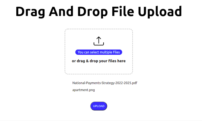
How to Implement Drag and Drop File Upload in Next.js
It is a common requirement for web applications to be able to upload files to a server. This can be achieved using the HTML5 Drag and Drop API and the...

Creating ChatBot Using Natural Language Processing in Python
A bot is a computer program that performs predetermined tasks automatically. Its goal is to perform human duties the same way humans do. In a nutshell, they...