


The Supercloud Platform
for API-first applications
Unprecedented cloud distribution, performance and availability at the lowest cost possible
Deliver apps within milliseconds of end users


CloudFlow is your unfair, competitive advantage to deliver world-class digital experiences
Unprecedented Workload Automation
Leveraging AI and ML data, our autonomous location orchestration dynamically optimizes the delivery network for peak efficiency and performance. 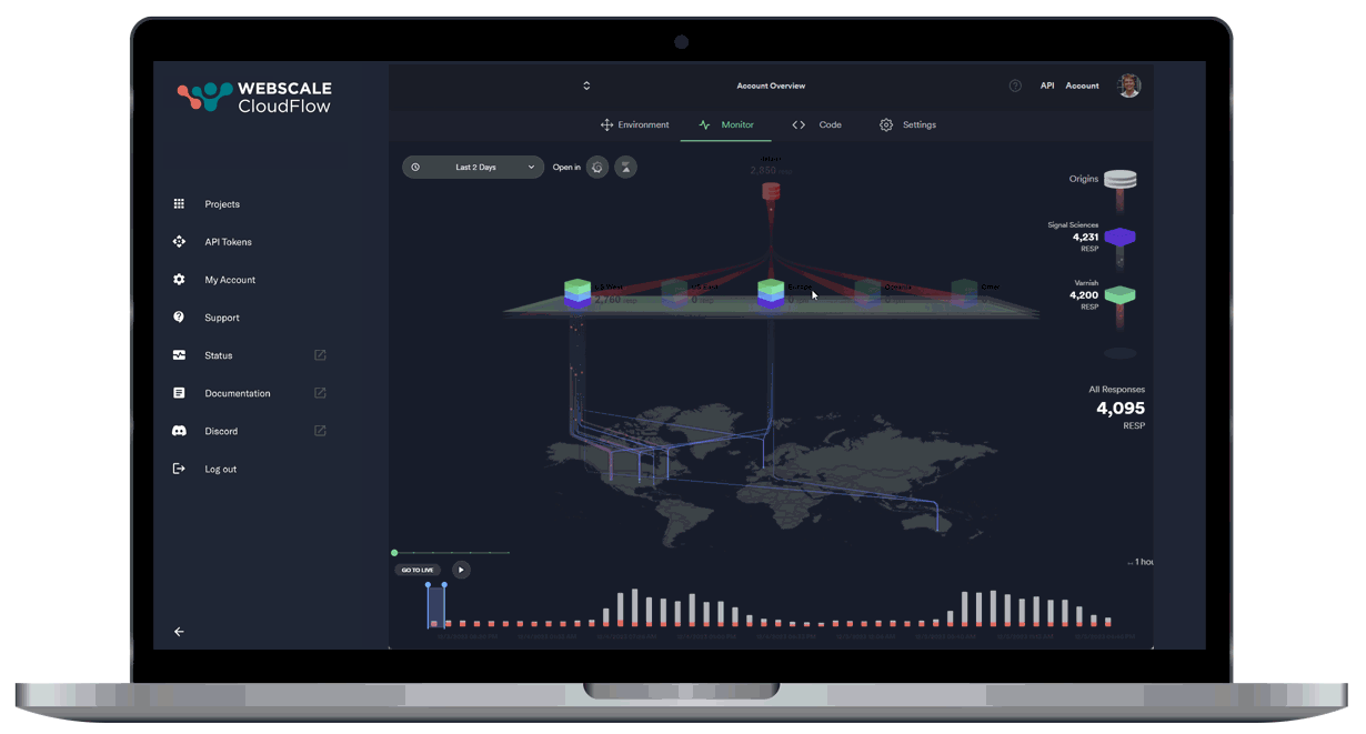
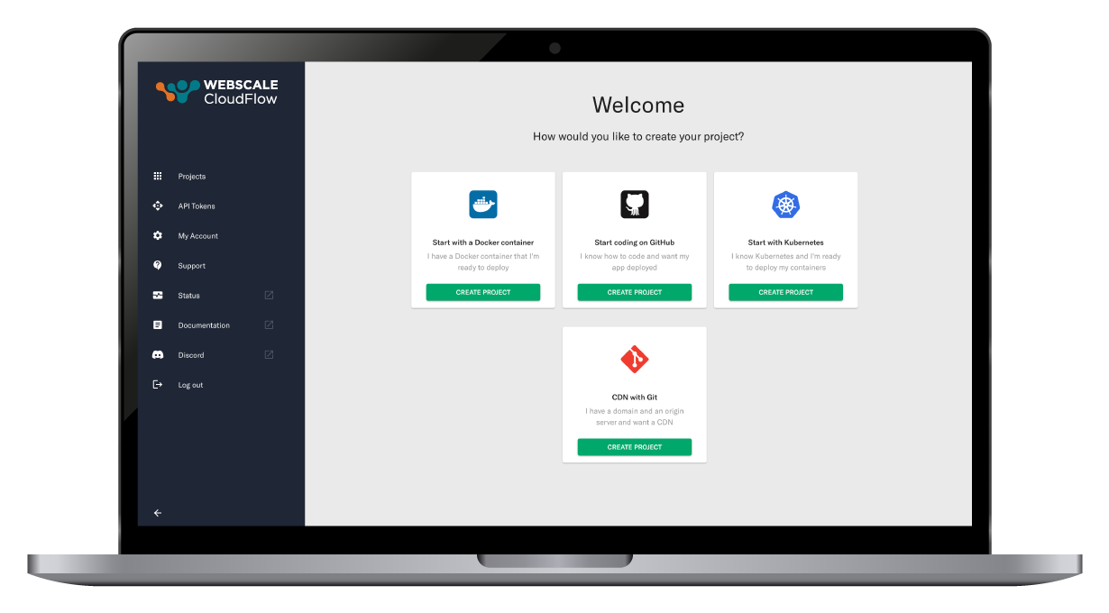
Developer-centric project launch journey
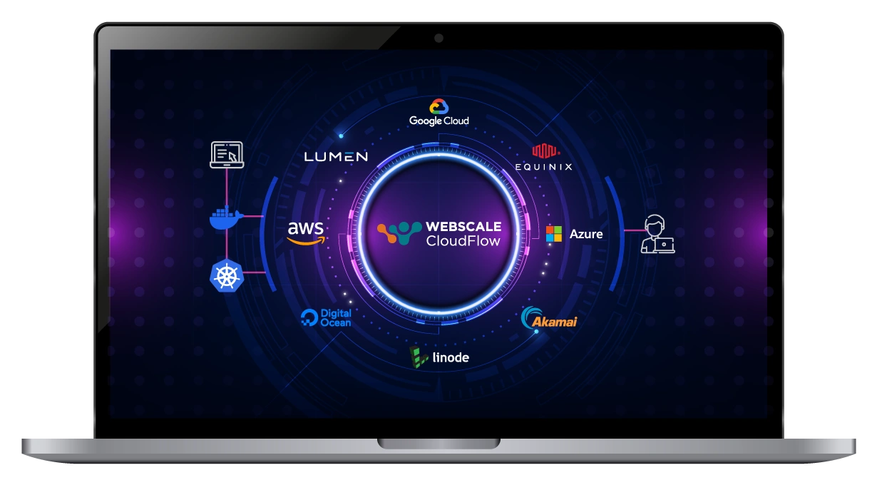
Supercloud distribution at your fingertips
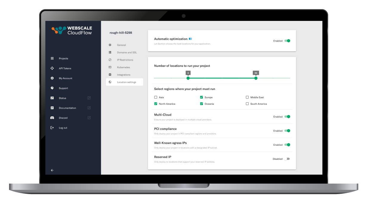
Customize your location policies and guard rails
Unprecedented Workload Automation
Leveraging AI and ML data, our autonomous location orchestration dynamically optimizes the delivery network for peak efficiency and performance.

Developer-centric project launch journey
Effortlessly kickstart your work using a container image, Kubernetes cluster, or directly from a GitHub Repository. Designed for ease and efficiency, our platform simplifies your development journey right from the start.

Supercloud distribution at your fingertips
Experience a truly integrated mesh network, connecting premier public and private cloud providers. This powerful fusion offers your applications a seamless and straightforward gateway to advanced Supercloud computing capabilities.

Customize your location policies and guard rails
Refine your parameters for optimizing the number of locations, preferred regions, compliance requirements, and more. Your policies influence dynamic server locations based on real-time traffic data, minimizing the distance for user requests and adapting to changing traffic patterns.
Supercloud
Simplicity-as-a-Service
The CloudFlow platform automates the orchestration of custom workloads, apps and APIs across a mesh network of private and public cloud providers.
We have created CloudFlow so you can harness the power of distributed, multicloud computing without the operational chaos that is traditionally involved with managing such a complex infrastructure network.


Our study revealed that CloudFlow enhances application performance, reduces cloud cost and eliminates K8s operational complexity
Customer Testimonials
Webscale has been an excellent and very much needed strategic partner in our explosive growth. The quality of service we’ve received from Webscale is like nothing I’ve come across in my 11 plus years in the industry. I would recommend Webscale to anyone without hesitation.
 |
Rick Wilson Executive Director of IT, Trulieve |
 |
Alex Diaz VP of Security Solutions, Wallarm |
 |
Stuart Rowlands Founder & CEO, QuantCDN |
Webscale is the only hosting provider that we recommend to our clients. They have the best customer service, they respond quickly, and we trust that they are going to do right by our clients. Most importantly they actually care about what they do.
 |
John Kraft Founder and CEO, Binary Anvil |
Webscale listens to our needs and has always exceeded our expectations. The team is always accessible, personable and listens to whatever questions or concerns we have along the way. The entire process from inception to launch went extremely well and we could not have been happier.
 |
Adam Greenwell Manager Web Development, Performance Health |
We’ve been deeply impressed with the work Webscale has done to deliver security, predictive scalability and performance to their customers around the world, while providing real-time visibility into traffic. Our engagement brings enormous value to both current and future Crownpeak clients.
 |
Al Mays Chief Product and Technology Officer, Crownpeak |
I must tell you that your support team is something I have never encountered before in my professional career. Excellent, responsive and customer service oriented – words do not do them justice. I love these guys and your service.
 |
Gregory Dihu Director Corporate Applications, Regal Cinemas |
Read our Latest Blogs

How to Solve GraphQL Latency Challenges by Deploying Closer to Your Users
GraphQL is a widely adopted alternative to REST APIs because of the many benefits that it offers, including performance, efficiency, and predictability. While the advantages are significant, many developers become frustrated with latency challenges when implementing...

Headless Commerce Drives Edge Computing Adoption
In e-commerce today, the challenge to meet and exceed customer expectations is driving innovation. The demand for frictionless shopping, 24/7 availability, superior product and impeccable service quality is ever increasing, putting pressure on retailers to deliver...

Two Aspects of Edge Compute to Focus on for Reducing Edge Complexity
As organizations look to capitalize on the benefits of edge computing, many are quickly realizing the complexities associated with building and operating distributed systems – including sourcing distributed compute, resource management/placement/sizing/scaling,...